Showing posts with label Blogger. Show all posts

How To Redirect A URL To Another URL In Blogger

URLs RedirectionNow you can have the power of redirecting your existing blogger URLs to another URL means you can redirect any URL of your blog to any new URL whether inside your blog or to outside/external links. This technique will work like as an URL 301 Redirect/shortner or URL cloaking in WordPress. We will be using a simple HTML code to redirect the URLs of our blog to any other specific URLs of your choice. Now you may be thinking that what is the benefit of it to you? The answer is very simple:-


  • You can hide your affiliate links behind your own blog URLs.
  • You can redirect any blogger URL to any other URL.
  • In place of long and odd URLs, you can create short and simple URLs.
So isn't it beneficial to you? If you are promoting any affiliate products on your blog then this technique is extremely useful to you because most of the readers/visitors do not click links when they see long and odd affiliate URLs. Instead of letting them see the original URLs before clicking, just hide them with simple and smooth URLs of your own blog URLs.

How To Create A URL Redirect To Another URL In Bogger- 301

To redirect a URL to another URL, you need to create a New Blank Page and do not create a new post because if you create a new post then it will appear in your published posts. If you are using a custom template with the custom navigation bar then your New Blank Page will not appear as it is hidden because you have your custom navigation bar and pages are hidden. So by now you will have a new page with link address ready to be redirected for e.g., Demo link is → http://zindex-999.blogspot.in/p/hug-me.html which redirects to my this post.
Now without any delay just get into action. Go to Blogger→Template→Edit Template→ Backup Your Template Before Editing.
Now Search For ]]></b:skin> and copy paste the code given below after this ]]></b:skin> code line
(Note: - Click inside template code and use Ctrl+f in Windows or Cmd+f in Mac to search the code in template easily)
<!--TB 301 Redirect-->
<b:if cond='data:blog.url == &quot;http://zindex-999.blogspot.com/p/hug-me.html&quot;'>
<meta content='0;url=http://twistblogger.com' http-equiv='refresh'/>
</b:if>
Important Note: -  This is the only piece of code you need to copy paste and you are done. You need to edit the above code to make it work for you so replace the http://zindex-999.blogspot.com/p/hug-me.html with the URL of your New Blank Page you created earlier. Then replace the http://www.twistblogger.com with any Url of your wish where you want to make a redirect. It can be an affiliate link or any other link, internal or external.

This way the visitors will not know the exact URL behind it until they visit it so this is the good trick to hide your main URL.

Now add your redirected URL to custom robots.txt file to Disallow the redirected link so that search engines will not index and rank this URL (For Safe SEO). Also while sharing/adding this URL in your post, add rel='nofollow' attribute to it. The example about how to add the link to custom robots.text file. Go to Blogger→Settings→Search Preferences→Custom Robots.text. Now click on Edit link then Yes and enter the following code. Do not forget to change the link /p/hug-me.html to your own Blog's Redirected URL.
User-agent: *
Disallow: /search
Disallow: /p/hug-me.html
Allow: /
PS: This redirect will not work if you will use the old deleted URL of your blog or any URL which does not exist on your blog as redirecting URL. If you want to make redirects from your old deleted posts to your homepage or to any other new posts then go to Blogger→Settings→Search Preferences→Custom Redirects. Now click on edit then follow the instructions as shown in the image.

Blogger Custom Redirects

As shown in the image, you only need to enter the links after http://www.yourdomain.com means if you had deleted a post with URL http:www.yourdomain.com/2012/01/Deleted-Post.html then you need to enter link /2012/01/Deleted-Post.html only not the full URL. I hope you got it but if anything creating any problem then do not hesitate to ask in the comments. We will serve you best. Thank You.

Add Contact Form To Blogger Pages - Responsive and Pro Version

Add Blogger Contact Form to Separate Page
Blogger users were gifted back in 2013 when official Blogger Contact form widget was introduced along with other awesome features in blogger dashboard.

We got a huge pain relief from using other third party contact form widgets.

Soon after it was released, many awesome developers customized it with their CSS abilities and gave it a new fresh look on their blogs and offered the same for other blogger users.

Every other blogger has his/her own choices and many did not like it to appear into sidebar or footer as a gadget but they wanted it to install into a separate page of blogger like as WordPress.


I have also written a detailed post on it about How to Add Blogger Contact Form to Separate Page on Blogger. You'l find it a complete step by step guide if it is the first time you're using this contact form widget on a separate page of your blog. You'll find all other major questions answered in my previous article regarding blogger contact form not working.

So what is so special in today's article you ask?

Well, in my previous article about it, I had customized this form but it was not a pro version at all. But when I looked into my posts area then I got to know that this is one of the most visited articles on my blog.

Then I thought to re-design it from scratch again and make it Professional Looking contact form widget.

All in all, I am happy with the final design and before making it a final copy, I asked my best buddies for their Feedback on its design from time to time. I changed it accordingly many times until they marked it a Professional looking. :) 

Features of new contact form widget design:

1) Fully Responsive Design

2) Designed with pure CSS

3) FontAwesome Icons Integration

4) Professional Looking

5) Center Screen

So I hope you guys would love to use it on your blogs. Below is the Demo Screenshot of it and for Live demo, just visit my contact page here.


Professional Blogger Contact Form Demo


Did you like the above design? Can we call it a professional version? If yes then here is how to use it on your own blog now. :)

I always share my widgets with everyone and use the same on my blog, No partiality! Except the Template itself. :) But I am working on it and soon I'll release my first blogger template too (hopefully better then my own).

Adding Blogger Contact Form To A Separate Page

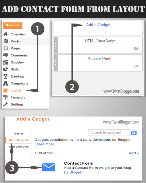
Step 1) This step is for those who have not installed the blogger Contact form widget from Blogger Library first. I hope you're already logged into your blogger account so now head over to Layout area of your blog and click on Add a Gadget link into sidebar or footer. Now click on More Gadgets link and add the contact form from there. See the screenshot below for step by step procedure.

How to a Create New Page on Blogger and Add Contact Form


Step 2) After adding the contact form into sidebar, now we will hide it from appearing as a gadget so now just head over to Template section of your blog then click on Edit HTML button. After that just find out this code line ]]></b:skin> and just before that code line, paste the CSS code given below as it is.

div#ContactForm1 {
    display: none !important;
}

As you know that we are using the FontAwesome Icons and if you're not using them already on your blog, then you got to install them first otherwise those icons will not appear as shown in the demo screenshot above.

Step 3) To add the FontAwesome icons in your template, just find out this opening tag <head> (found in the beginning part of your template code) and just below that, paste the FontAwesome icons' CSS link given below as it is.

<link href='http://netdna.bootstrapcdn.com/font-awesome/4.4.0/css/font-awesome.css' rel='stylesheet'/>
Now save your template code because you're done with it.

Step 4) Now we will add the contact form to a separate page of our blog. If you already have a separate page for contact form and using a contact form already then you need not to create a new page. But if this is the first time then got to Pages link and on top, click on New Page link.

Note:- When blogger post editor is loaded then immediately before doing anything else, just enter your page name in the title box as Contact Us. This is the most important step because you'll get the same permalink address for your new page. You'll not be able to edit your permalink in anyway later.
If you skipped this and entered the codes first then you'll get a weird permalink address for contact us page.

After that Switch to HTML Mode and change the page settings from left side as shown in the screenshot below.


Step 5) You're almost done by now and all you need is simple Copy and Paste the code. So just select the whole CSS and HTML code given below and paste into HTML Editor as it is.

(Important Note:- You don't have permission to copy and share my codes on your blog in any way. Respect the hard work of others'. I have put a lot of efforts into designing it and you can see that by looking at the CSS Code itself)

CSS Part:-
<style>
/****** Contact Form Designed by www.TwistBlogger.com ******/
div#twist_blogger_cntct_form {
    padding: 50px 0px;
    border-radius: 2px;
    color: #1D1D1D;
    font-size: 15px;
    font-weight: bold;
    position: relative;
    background-color: #404040;
    font-family: sans-serif;
}
div#twist_blogger_cntct_form .wrap-me {
    margin: 0 auto;
    display: block;
    padding: 30px 20px;
    background-color: #F3F3F3;
    max-width: 440px;
    width: 100% !important;
    border-top: 65px solid #FF0000;
    box-sizing: border-box;
}
div#twist_blogger_cntct_form .wrap-me:before {
    content: '\f0e0';
    position: absolute;
    font-family: FontAwesome;
    font-weight: normal;
    margin-top: -88px;
    margin-left: -23px;
    left: 50%;
    display: inline-block;
    font-size: 28px;
    width: 53px;
    height: 53px;
    border-radius: 50px;
    text-align: center;
    color: #FFFFFF;
    box-sizing: border-box;
    border: 2px solid #FFFFFF;
    line-height: 49px;
}
input#ContactForm1_contact-form-name, #ContactForm1_contact-form-email, #ContactForm1_contact-form-email:hover, #ContactForm1_contact-form-email:active {
    padding: 5px;
    margin-top: 4px !important;
    box-shadow: none!Important;
    max-width: 300px;
    width: 100%;
    border: 1px solid #D2D2D2;
    line-height: 1em;
    min-height: 31px;
    background: #FEFEFE;
    font-family: sans-serif;
    margin-bottom: 15px;
    border-radius: 0px;
}
.contact-form-email-message, .contact-form-email-message:active, .contact-form-email-message:hover {
    padding: 5px;
    margin-top: 4px !important;
    box-shadow: none!Important;
    max-width: 400px;
    width: 100%;
    border: 1px solid #D2D2D2;
    line-height: 1em;
    min-height: 80px;
    background: #FEFEFE;
    font-family: sans-serif;
    margin-bottom: 10px;
    border-radius: 0px;
}
/***** Focus *****/
#ContactForm1_contact-form-name:focus, #ContactForm1_contact-form-email:focus, #ContactForm1_contact-form-email-message:focus {
    outline: none;
    background: #FFFFFF !important;
    color: #444;
    border-color: rgb(236, 235, 235) !important;
    box-shadow: 0 0 5px rgba(241, 241, 241, 0.7) !important;
    transition: all 0.3s ease-in-out !important;
}
/**** Submit button style ****/
.contact-form-button-submit:hover {
    color: #FFFFFF;
    background: #0083FF !important;
}
.contact-form-button-submit {
    background: #19B3EA;
    display: table;
    font-size: 17px;
    margin: 0 !important;
    border-radius: 0 !important;
    max-width: 100%;
    width: 100%;
    min-width: 100%;
    height: 32px;
    line-height: 0.5em;
    letter-spacing: 0.5px;
    font-family: sans-serif;
    font-weight: normal;
    cursor: pointer;
    outline: none!important;
    color: #FFFFFF;
    border: 1px solid #fff !important;
    text-align: center;
    padding: 0px 0px 0px 15px;
    text-transform: capitalize;
    transition: all 300ms ease-in-out;
    -webkit-transition: all 300ms ease-in-out;
    -moz-transition: all 300ms ease-in-out;
}
/**** Submit button on Focus ****/
.contact-form-button-submit:focus, .contact-form-button-submit.focus {
  border-color: #FFFFFF;
  box-shadow: none !important;
}
/**** Error message ****/
.contact-form-error-message-with-border .contact-form-success-message {
  background: #f9edbe;
  border: 1px solid #f0c36d;
  bottom: 0;
  box-shadow: 0 2px 4px rgba(0,0,0,.2);
  color: #666;
  font-size: 12px;
  font-weight: bold;
  padding-bottom: 10px;
  line-height: 19px;
  margin-left: 0;
  opacity: 1;
  position: static;
  text-align: center;
}
/**** Submit Button On Success Message ****/
.contact-form-button-submit.disabled, .contact-form-button-submit.disabled:hover, .contact-form-button-submit.disabled:active {
    opacity: 0.9;
}
/****** Success Message *****/
.contact-form-error-message-with-border {
    background: #000000;
    border: 1px solid #5A5A5A;
    bottom: 0;
    box-shadow: none;
    color: #FDFDFD;
    font-size: 15px;
    font-weight: normal;
    line-height: 35px;
    margin-left: 0;
    opacity: 1;
    position: static;
    text-align: center;
    height: 35px;
    margin-top: 45px;
}
.contact-form-cross {
    height: 14px;
    margin: 5px;
    vertical-align: -8.5%;
    float: right;
    width: 14px;
    border-radius: 50px;
    border: 0 !important;
    cursor: pointer;
}
.contact-form-success-message-with-border {
    font-weight: normal;
    background-color: #000;
    border: 1px solid #FFF;
    color: #FFF;
    line-height: 35px;
    margin-left: 0;
    font-size: 13px;
    opacity: 1;
    position: static;
    text-align: center;
    height: 35px;
    margin-top: 45px;
}
/* Extra Stuff */
div#twist_blogger_cntct_form span.name-bg {
    background-color: #E8F2FF;
 }
div#twist_blogger_cntct_form span.email-bg {
    background-color: #FFE8E8;
}
div#twist_blogger_cntct_form span.name-bg, div#twist_blogger_cntct_form span.email-bg {
    display: inline-block;
    max-width: 300px;
    line-height: 21px;
    width: 100%;
    color: #696969;
    padding: 3px 5px;
    margin: 0px 0px 4px;
    box-sizing: border-box;
    height: 30px;
    border: 1px solid #E4E0E0;
    padding-left: 39px;
}
div#twist_blogger_cntct_form span.name-bg:before {
    content: '\f007';
    background-color: #60A2FF;
 }
div#twist_blogger_cntct_form span.email-bg:before {
    content: '\f1fa ';
    background-color: #FF530B;
}
div#twist_blogger_cntct_form span.name-bg:before, div#twist_blogger_cntct_form span.email-bg:before, div#twist_blogger_cntct_form span.message-bg:before {
    font-family: FontAwesome;
    text-align: center;
    margin: -4px 0 0px 0px;
    font-weight: normal;
    padding: 0;
    line-height: 27px;
    width: 28px;
    height: 28px;
    display: table;
    position: absolute;
    margin-left: -40px !important;
    border: 1px solid rgba(0, 0, 0, 0.1);
    border-right: 0 !important;
    color: #FFFFFF;
}
div#twist_blogger_cntct_form span.message-bg {
    background-color: #EBFFE8;
    display: inline-block;
    max-width: 400px;
    line-height: 21px;
    width: 100%;
    color: #696969;
    padding: 3px 5px;
    box-sizing: border-box;
    height: 30px;
    border: 1px solid #E4E0E0;
    padding-left: 39px;
    margin: 0px 0px 4px;
}
div#twist_blogger_cntct_form span.message-bg:before {
    content: '\f0e0';
    background-color: #20CC00;
}
div#twist_blogger_cntct_form span.send-bg {
    height: 32px;
    display: inline-block;
    float: left;
    max-width: 45%;
    width: 100%;
    margin-top: 15px;
    transition: all 0.4s ease-in-out !important;
}
div#twist_blogger_cntct_form span.send-bg:before {
    content: '\f1d8';
 }
div#twist_blogger_cntct_form span.send-bg:before, div#twist_blogger_cntct_form span.clear-bg:before {
    font-family: FontAwesome;
    text-align: center;
    font-weight: normal;
    margin: 0;
    background-color: #000;
    padding: 0;
    line-height: 27px;
    width: 30px;
    height: 30px;
    display: inline-block;
    position: absolute;
    border: 1px solid #fff;
    border-right: 0 !important;
    color: #FFFFFF;
}
div#twist_blogger_cntct_form span.clear-bg {
    display: inline-block;
    float: right;
    margin-top: 15px;
    max-width: 45%;
    width: 100%;
}
div#twist_blogger_cntct_form span.clear-bg:before {
    content: '\f021';
 }

input.contact-form-button.contact-form-button-submit.clear-button:hover {
    background-color: #E83434 !important;
}
div#twist_blogger_cntct_form .clear-button {
    color: #FFFFFF;
    border: 1px solid #FFF !important;
    background-color: #FF2C2C;
    float: right;
    display: table;
    height: 32px;
}
</style>

HTML Part:-

<div id="twist_blogger_cntct_form">
<div class="wrap-me">
<form name="contact-form">
<span class='name-bg'>Your Name</span><br />
<input class="contact-form-name" id="ContactForm1_contact-form-name" name="name" placeholder="Enter your name here..." size="30" type="text" value="" /><br />
<br />
<span class='email-bg'>Your Email*</span><br />
<input class="contact-form-email" id="ContactForm1_contact-form-email" name="email" placeholder="Enter your email here..." size="30" type="text" value="" /><br />
<br />
<span class='message-bg'>Your Message*</span><br />
<textarea class="contact-form-email-message" cols="25" id="ContactForm1_contact-form-email-message" name="email-message" placeholder="Write your message here..." rows="5"></textarea><br />
<span class='send-bg'><input class="contact-form-button contact-form-button-submit" id="ContactForm1_contact-form-submit" type="button" value="Send" /></span>
<span class='clear-bg'><input class='contact-form-button contact-form-button-submit clear-button' type='reset' value='Clear'/></span>
<br />
<div style="max-width: 100%; text-align: center; width: 100%;">
<div class="contact-form-error-message" id="ContactForm1_contact-form-error-message">
</div>
<div class="contact-form-success-message" id="ContactForm1_contact-form-success-message">
</div>
</div>
</form>
<br />
</div>
</div>
Now just hit Publish button buddy.  Finished? We did it! Yay! :) Now just visit your contact us page and see it live yourself. I hope it was a super easy to follow tut and I made clear all the things.

Still if you have some problems then please let me know, I'll help you for sure. I hope you guys liked this new look of blogger contact us form widget in a separate page of your blog.

Recommended:- How to Create Landing Pages on Blogger

If you have little time then you may share this article. :)

Thanks and Stay Blessed!

Add Custom Social Media Share Buttons to Blogger Posts

Add Custom Social Media Share Buttons to Blogger Below Post Title and Post FooterSocial Media Platforms (sites) play a major role in overall success of our content because SEO takes time to drive targeted traffic from search engines.

Not to mention, social signals (how many times your content has been shared on different social media sites) has an impact on your overall SEO in many ways.

So I am not going to write an essay on Social Media strategy but, today I am going to share another version of Custom Horizontal Social Media Share Buttons for Blogger along with total shares count. You can add these buttons below the post titles or in footer to increase the social shares of your well written content.

These social media buttons are made purely with the help of HTML and CSS so they don't affect the Page load time speed at all.
Even by removing the Official Social Media Share Buttons from your blog, you can decrease your page load time by half of the total time.

Features:-
1) Fully Responsive Design
2) Made with Pure CSS and HTML
3) Shares Counter
4) Integration of FontAwesome Icons
5) 5 Social Media Share Buttons Included
6) Super Easy to Install (Copy and Paste)

Responsiveness: Check out the below Screenshot which shows the Responsiveness of these social media share buttons on different screen resolutions in one go.

Responsive Social Media Share Buttons for Blogger

Live Demo: If you want to see the live demo then just scroll down to the post footer and watch these buttons live.


Important Update and read Carefully:-
I use Free hosting provided by OpenShift.com for hosting PHP scripts which are liable to get the shares count of all the social media sites. There is monthly bandwidth limit and shares count script will stop working if limit is crossed.

You can upload these PHP scripts yourself if you have premium hosting or else you can use OpenShift.com to get free hosting. Free hosting is enough for one blog.

If you can't manage it yourself then you can hire me. I'll upload these scripts for you and make it working without any issue.

Get PHP Scripts Here = https://github.com/abeMedia/shareCount

How to Add Custom Social Media Buttons to Blogger Posts

Step 1) As usual, login to your blogger account > Select your blog > go to Template section > click on Edit HTML and let the Template Editor load. Do not forget to save template backup before altering anything, be safe.

Step 2) As you know that we are using FontAwesome icons for it so you need to install them in your blog first otherwise icons would not appear. So find out this opening <head> tag (click inside template editor and press Ctrl+F on windows or Cmd+F on Mac to open up a search box inside template editor) and just below that, paste the FontAwesome icons link given below (only if you're already not using them on your blog, avoid adding same codes twice).

<link href='http://netdna.bootstrapcdn.com/font-awesome/4.4.0/css/font-awesome.css' rel='stylesheet'/>

You also need to add Google JavaScript Libraries link to make the shares count API work. So add the link given below if you're already not using (rare case, please check before adding).

<script src='http://ajax.googleapis.com/ajax/libs/jquery/1.7.1/jquery.min.js' type='text/javascript'/>


Step 3) So now you need to add the CSS code to your template so just find out this closing </head> tag and just before this tag, paste the whole CSS code given below as it is.

CSS code:-
<b:if cond='data:blog.pageType == &quot;item&quot;'>
<style type='text/css'>
/*------------------------------------------------------------
Horizontal Social Media Share Buttons for Blogger
Designed by:: http://www.TwistBlogger.com
Shares Count Code by:: http://donreach.com/social-share-count
issued under GNU GPL Licence
Icons:: FontAwesome
******** Do Not Remove These Credits ********
------------------------------------------------------------*/
.tbn_horizontal_sharebar {
    position: relative;
    background: none;
    z-index: 2;
    width: 100%;
    padding: 10px 0;
    display: inline-block;
    font-family: sans-serif;
    margin: 5px 0px;
    border-top: 1px dotted rgba(0, 0, 0, 0.05);
    border-bottom: 1px dotted rgba(0, 0, 0, 0.05);
}
.tbn_horizontal_sharebar .Share_buttons {
 display: block;
}
.tbn_horizontal_sharebar .Share_buttons .wrap {
    text-align: center;
    margin: 0 auto;
    display: inline-block;
    min-width: 41px;
}
.tbn_horizontal_sharebar .Share_buttons .wrap1 {
    display: inline-block;
    width: 31px;
    float: left;
}
.tbn_horizontal_sharebar .Share_buttons ul {
    margin: 0;
    padding: 0;
}
.tbn_horizontal_sharebar .Share_buttons ul li a, .tbn_horizontal_sharebar .Share_buttons ul li a:hover {
    color: #FFF !important;
    cursor: pointer;
    line-height: 25px;
    height: 100%;
    display: block;
    text-decoration: none;
}
.tbn_horizontal_sharebar .Share_buttons ul li {
    list-style: none;
    list-style-type: none;
    padding: 0;
    margin: 1px;
    float: left;
    width: 16%;
    max-width: 115px;
    display: inline-block;
    font-size: 13px;
    overflow: hidden;
    text-align: left;
    height: 25px;
    line-height: 25px;
    color: #fff;
    border: 1px solid rgba(0,0,0,0.04);
    -webkit-transition: all 0.4s ease-in-out;
    -moz-transition: all 0.4s ease-in-out;
    -ms-transition: all 0.4s ease-in-out;
    -o-transition: all 0.4s ease-in-out;
    transition: all 0.4s ease-in-out;
}
.tbn_horizontal_sharebar .Share_buttons ul li .fa {
    color: #fff;
    font-size: 17px;
    font-weight: normal;
    font-family: FontAwesome;
    display: inline-block;
    text-align: center;
    padding: 0;
    height: 25px;
    line-height: inherit;
    width: 30px;
    background-color: rgba(0,0,0,0.1);
    border-right: 1px solid rgba(0,0,0,0.05);
}
/*--Facebook---*/
.tbn_horizontal_sharebar .Share_buttons .btn_fb {
    background: #3a579a;
}
.tbn_horizontal_sharebar .Share_buttons .btn_fb:hover {
    background: #314a83;
}
/*--Tweeter---*/
.tbn_horizontal_sharebar .Share_buttons .btn_twtr {
    background: #00abf0;
}
.tbn_horizontal_sharebar .Share_buttons .btn_twtr:hover {
    background: #0092cc;
}
/*--Google Plus---*/
.tbn_horizontal_sharebar .Share_buttons .btn_gplus {
    background: #df4a32;
}
.tbn_horizontal_sharebar .Share_buttons .btn_gplus:hover {
    background: #be3f2b;
}
/*--Pinterest---*/
.tbn_horizontal_sharebar .Share_buttons .btn_pntrst {
    background: #cd1c1f;
}
.tbn_horizontal_sharebar .Share_buttons .btn_pntrst:hover {
    background: #ae181a;
}
/*--linkedin---*/
.tbn_horizontal_sharebar .Share_buttons .btn_linkdin {
    background: #2554BF;
}
.tbn_horizontal_sharebar .Share_buttons .btn_linkdin:hover {
    background: #224EB4;
}
/*---Total Share----*/
.tbn_horizontal_sharebar .Share_buttons .share.h6 {
    font-size: 10px;
    font-weight: bold;
    text-shadow: none!important;
    text-decoration: none;
    text-align: center;
    color: #000000;
    border-top: 3px solid #FFF600 !important;
    border-bottom: 0;
    padding: 0px !important;
    padding-top: 5px!important;
    margin: 0 !important;
    line-height: 8px;
    border-radius: 75% 0;
}
.tbn_horizontal_sharebar .Share_buttons .share {
    border: none;
    margin: 0px 5px 0px 1px;
    overflow: visible !important;
    width: 95px !important;
}
.tbn_horizontal_sharebar .Share_buttons .share .count.h4 {
    font-size: 18px;
    font-weight: bold;
    text-shadow: none;
    text-decoration: none;
    font-family: sans-serif;
    text-align: center;
    color: #FF0000;
    line-height: 15px;
    margin-top: 0px;
    margin: -4px 0px 2px 0;
    min-height: 15px;
    padding: 0px;
    border: none;
}
.tbn_horizontal_sharebar .Share_buttons .btn_fb .share-btn,
.tbn_horizontal_sharebar .Share_buttons .btn_twtr .share-btn,
.tbn_horizontal_sharebar .Share_buttons .btn_gplus .share-btn,
.tbn_horizontal_sharebar .Share_buttons .btn_pntrst .share-btn,
.tbn_horizontal_sharebar .Share_buttons .btn_linkdin .share-btn {
    position: relative;
    color: #C3C3C3;
    display: inline-block;
    text-align: center;
    font-weight: bold;
    font-size: 11px;
    float: right;
    min-width: 12px;
    font-family: sans-serif;
    padding: 0px 5px;
    background-color: rgba(0,0,0,0.28);
    border-radius: 0px 0px 0px 15px;
}
 @media only screen and (max-width: 979px) {
 .tbn_horizontal_sharebar .Share_buttons .btn_linkdin {
  width: 34px;
}
.tbn_horizontal_sharebar .Share_buttons .btn_fb .share-btn,
.tbn_horizontal_sharebar .Share_buttons .btn_twtr .share-btn,
.tbn_horizontal_sharebar .Share_buttons .btn_linkdin .share-btn,
.tbn_horizontal_sharebar .Share_buttons .btn_gplus .share-btn,
.tbn_horizontal_sharebar .Share_buttons .btn_pntrst .share-btn
 {
 display: none !important;
}
}
 @media only screen and (max-width:768px) {
.tbn_horizontal_sharebar .Share_buttons ul li a, .tbn_horizontal_sharebar .Share_buttons ul li a:hover {
    color: #FFF !important;
    cursor: pointer;
    line-height: 25px;
    font-size: 11px;
    height: 100%;
    display: block;
    text-decoration: none;
}
.tbn_horizontal_sharebar .Share_buttons .wrap {
    min-width: 34px;
}
.tbn_horizontal_sharebar .Share_buttons .btn_linkdin,
.tbn_horizontal_sharebar .Share_buttons .btn_pntrst {
    width: 30px;
}
.tbn_horizontal_sharebar .Share_buttons ul li {
   margin: 1px 3px;
}
 @media only screen and (max-width:479px) {
 .tbn_horizontal_sharebar .Share_buttons .share {
    border: none;
    margin: 0px 5px 0px 1px;
    overflow: visible!important;
    width: 80px!important;
}
.tbn_horizontal_sharebar .Share_buttons ul li {
    width: 25px !important;
    margin: 2px;
    border-radius: 50px;
    border: 2px solid rgba(0, 0, 0, 0.14);
}
.tbn_horizontal_sharebar .Share_buttons .wrap {
    display: none !important;
}
.tbn_horizontal_sharebar .Share_buttons ul li .fa {
    width: 25px !important;
}
}
</style>
</b:if>

Now you are done with adding CSS part so moving on to next step.

Step 4)  Now you need to add the HTML part to your template. Below I am going to provide both the ways to add these buttons either below posts titles or in the post footer so please carefully read the steps and follow accordingly (needs not to mention, I am always there to help your out if anything goes wrong).

Add Social Media Buttons Below Post Titles
Find out this HTML code line <div class='post-header-line-1'/> in your template and just below that, paste the whole HTML part as it is. You may find the above code line twice so in that case, just paste the code after the second appearance of the above code line.

Add Social Media Buttons to Post Footer
Find out this HTML code line <div class='post-footer'> and just below that code line, paste the whole HTML code as it is.
If you did not find the above code line then try finding <div class='post-footer-line post-footer-line-1'> and paste the HTML just below it. Again if the code line appears more than one time then paste the HTML after second appearance.

Important Note:- If you're using my previous Floating Social Media Share Buttons Bar For Blogger then please it is my humble request not to use the same JavaScript code of Shares Count API.
Just delete the JavaScript API code and only use the HTML part because the previous JavaScript code will work fine with it. If you did not get it then please let me know.
JavaScript Code is highlighted in red color text.

HTML code:-
<b:if cond='data:blog.pageType == &quot;item&quot;'>
<b:if cond='data:blog.pageType != &quot;static_page&quot;'>
<script type='text/javascript'>//<![CDATA[
$(document).ready(function () {
  var shareUrl = $("link[rel=canonical]").attr("href");
    $.getJSON('https://count.donreach.com/?url=' + encodeURIComponent(shareUrl) + "&callback=?", function (data) {
        shares = data.shares;
        $(".count").each(function (index, el) {
            service = $(el).parents(".share-btn").attr("data-service");
            count = shares[service];
            if (count > 1000) {
                count = (count / 1000).toFixed(1);
                if (count > 1000) count = (count / 1000).toFixed(1) + "M";
                else count = count + "k";
            }
            $(el).html(count);
        });
    });
});
//]]></script>

<div class='tbn_horizontal_sharebar'>
<div class='Share_buttons'>
  <ul>
  <li class='share'>
    <div class='share-btn' data-service='total'>
        <div class='count h4'></div>
        <div class='share h6'>SHARES</div>
  </div>
  </li>
  <li class='btn_fb'><a expr:href='&quot;   http://www.facebook.com/share.php?v=4&amp;   src=bm&amp;   u=&quot; + data:post.url + &quot;   &amp;   t=&quot; + data:post.title' onclick='window.open(this.href,&quot;   sharer&quot;   ,&quot;   toolbar=0,status=0,width=626,height=436&quot;   );   return false;' rel='nofollow'>
<div class="wrap1"><i class="fa fa-facebook"></i> </div>
  <div class="wrap">Share</div>
  <div class='share-btn' data-service='facebook'>
        <div class='count'/></div>
  </a>
  </li>
  <li class='btn_twtr'><a expr:href='&quot;https://twitter.com/intent/tweet?url=&quot; + data:blog.url + &quot;&amp;text=&quot; + data:post.title + &quot; via @TwistBlogger - &quot;' onclick='window.open(this.href,&quot;   sharer&quot;   ,&quot;   toolbar=0,status=0,width=626,height=436&quot;   );   return false;' rel='nofollow'>
  <div class="wrap1"><i class='fa fa-twitter'></i></div>
  <div class="wrap">Tweet</div>
  <div class='share-btn' data-service='twitter'>
        <div class='count'/></div>
  </a>
  </li>
  <li class='btn_gplus'><a expr:href='&quot;http://plus.google.com/share?url=&quot; + data:blog.url' onclick='javascript:window.open(this.href,&quot;   &quot;   ,&quot;   menubar=no,toolbar=no,resizbutton_le=yes,scrollbars=yes,height=600,width=600&quot;   );   return false;   ' rel='nofollow'>
  <div class="wrap1"><i class='fa fa-google-plus'></i></div>
  <div class="wrap">Share</div>
  <div class='share-btn' data-service='google'>
        <div class='count'/></div>
  </a>
  </li>
  <li class='btn_pntrst'><a data-pin-config='beside' expr:href='&quot;   http://pinterest.com/pin/create/button/?url=&quot; + data:post.url + &quot;   &amp;media=&quot; + data:blog.postImageUrl + &quot;&amp;description=&quot; + data:post.title' onclick='window.open(this.href,&quot;   sharer&quot;   ,&quot;   toolbar=0,status=0,width=626,height=500&quot;   );   return false;' rel='nofollow'>
  <div class="wrap1"><i class='fa fa-pinterest'></i></div>
  <div class="wrap">Pin</div>
  <div class='share-btn' data-service='pinterest'>
        <div class='count'/></div>
  </a>
  </li>
  <li class='btn_linkdin'><a expr:href='&quot;   http://www.linkedin.com/shareArticle?mini=true&amp;   url=&quot; + data:post.url + &quot;   &amp;   title=&quot; + data:post.title + &quot;   &amp;   summary=&amp;   source=&quot;   ' onclick='window.open(this.href,&quot;   sharer&quot;   ,&quot;   toolbar=0,status=0,width=626,height=500&quot;   );   return false;' rel='nofollow'>
  <div class="wrap1"><i class='fa fa-linkedin'></i></div>
  <div class="wrap">Share</div>
  <div class='share-btn' data-service='linkedin'>
        <div class='count'/></div>
  </a>
  </li>
  </ul>
  </div>
  </div>
</b:if>
</b:if>

Editing Part:- All you need to edit in the above HTML part is my twitter username  @TwistBlogger so just replace it with your own Twitter username and you're good to go. Now just save your template code and visit any of your blog post to see it live.

If it did not appear on your blog even after following all the steps correctly then please let me know, I'll personally help you out for sure.

Also please let me know your feedback on the design and responsiveness. Does it work correctly? Appearing same as on this blog? Your feedback will help me to make it better if there are any bugs.

So this is all in this article and I hope you guys have liked it. If you liked it then surely your buddies would also like it if they using blogger platform. Let them know by sharing it on at least one social site you actively use. :)

Thanks and stay blessed!

Make Embedded Videos Responsive in Blogger - Add Elegant Frames

Make Embedded Videos Responsive and Add Responsive Frames
Videos are used widely along with text content in blog posts and today's article is all about how to make those embedded videos responsive plus display them inside elegant frames of your choice.

Making videos responsive is the easy task to accomplish but along with that, displaying those videos inside beautiful frames was little tedious for me.

I am going to share two different frames where first one is a image frame of blank MacBook so it appears as if video is playing inside it.

Second frame is what I have designed with pure CSS and added some cool shadows effect in the bottom using pseudo elements. I hope you'll like it.

So what will you get in this post?
1) Making Embedded Videos Responsive without adding any frame.
2) Display Video Inside Responsive Frame Made of Pure CSS.
3) Display Video Inside Responsive Image Frame of a Blank MacBook.

So choice is yours, they all are responsive. :)
(Note:- You don't have permission to copy and share my code on your blog)


1) Make Embedded YouTube Videos or Vimeo Videos Responsive

When you get the code to Embed your video from YouTube or any other video hosting site, your code will contain a fixed height and width properties. So when someone visits your site from small resolution devices like as mobile or a tablet, then your embedded video will not re-size itself according to the screen size.

It will always contain its height and width to the original values despite the screen size. So it will either make a scrolling bar on small screen sizes or else it will hide the video part which is overflowing (If overflow: hidden; property is used for the content wrapper). You can not make them responsive like the way you can do with images.

If the scrolling bar is appearing then that particular page will also show an error in your webmaster tools account if you will check it for responsive design (Bad for SEO?).

I wrote that all just because I wanted to to tell you about how important is it to make your embedded videos responsive.

So how to do it?

It is simple enough to do with the help of CSS. So follow the steps given below and be responsive. :D

CSS Part

<style>
.video_outer_wrap {
    width: 100%;
    max-width: 560px;
    margin: 15px auto;
}
.video_wrap {
    position: relative;
    padding-bottom: 56%;
    padding-top: 0px;
    height: 0;
    background-color: #000 !important;
}
.video_wrap iframe,
.video_wrap object,
.video_wrap embed {
    position:absolute;
    top:0;
    width:100%;
    height:100%;
}
</style>


HTML Part

<div class="video_outer_wrap">
 <div class="video_wrap bottomshadows">
 <iframe width="560" height="315" src="https://www.youtube.com/embed/LxuVerR2lFU" frameborder="0" allowfullscreen></iframe> </div>
</div>


How to use it?

CSS:- Copy the above CSS Part first then switch to HTML Mode of your blogger post editor and paste the the whole CSS code as it is  (Will work for WordPress too).

(Note: You can also paste the CSS code inside your blogger template skin so that you don't have to paste the CSS code every time in any of your blogger post. If you want to paste the code inside your template then copy the CSS code without the <style> tag and paste it just before ]]></b:skin> and save your template.

HTML:- Copy the HTML code and Paste inside your post editor after switching to HTML mode. You have to paste the HTML where you want your video to be appeared in  your content. Now for adding your video, just replace the code highlighted in yellow color with the embed code you got from your YouTube or Vimeo video.

(Note:- To get the embed code for your video on YouTube, just right click on the video player and select Get embed code. You will get your code in the middle of your video screen so copy it from there.)

If you followed all the steps correctly then you will have your video which is fully responsive. You can check it live by re-sizing your browser window easily.

Now I am going to share those two other ways along with live demo for adding cool frames and the process of using the code will be same as explained above so I am not going to re-write it again (except few changes).

2) Add A Beautiful Frame to Embedded Videos Using Pure CSS

I love this one because it is made with pure CSS and loads as fast as you know. :) It has got really cool design and shadows effect in the bottom.

I have also disabled the Video title Info which appears on the top of it and the related videos which appear in the end of video.

Watch the live demo given below.


CSS Part for it

<style>
.tbn_css_frame_wrap {
    width: 100%;
    max-width: 560px;
    margin: 30px auto;
}
.tbn_css_frame_wrap_inner {
    position: relative;
    padding-bottom: 53%;
    height: 0;
    background-color: #000 !important;
    border: 15px solid #CACACA;
}
.tbn_css_frame_wrap_inner iframe,
.tbn_css_frame_wrap_inner object,
.tbn_css_frame_wrap_inner embed {
    position:absolute;
    top:0;
    width:100%;
    height:100%;
}
.bottomshadows
{
  position: relative;
}
.bottomshadows:before, .bottomshadows:after
{
  z-index: -1;
  position: absolute;
  content: "";
  bottom: 0px;
  left: 10px;
  width: 50%;
  top: 80%;
  max-width:300px;
  background: #777;
  -webkit-box-shadow: 0 15px 10px #777;
  -moz-box-shadow: 0 15px 10px #777;
  box-shadow: 0 15px 10px #777;
  -webkit-transform: rotate(-4deg);
  -moz-transform: rotate(-4deg);
  -o-transform: rotate(-4deg);
  -ms-transform: rotate(-4deg);
  transform: rotate(-4deg);
}
.bottomshadows:after
{
  -webkit-transform: rotate(4deg);
  -moz-transform: rotate(4deg);
  -o-transform: rotate(4deg);
  -ms-transform: rotate(4deg);
  transform: rotate(4deg);
  right: 10px;
  left: auto;
}
@media all and (max-width: 400px) {
.tbn_css_frame_wrap_inner {
    border: 7px solid #CACACA !important;
}
.bottomshadows:before, .bottomshadows:after {
    bottom: 9px !important;
} }
</style>

HTML Part for it

<div class="tbn_css_frame_wrap">
 <div class="tbn_css_frame_wrap_inner bottomshadows">
 <iframe width="560" height="315" src="https://www.youtube.com/embed/LxuVerR2lFU?rel=0&theme=light&hd=1&showinfo=0" frameborder="0" allowfullscreen></iframe>
 </div>
</div>

Editing Step:- Please take note that this time you need not to paste your embedding code from YouTube as it is so instead just replace the Video id which is highlighted in the yellow color above. You can easily get this id from the address bar of your browser. See the example:

https://www.youtube.com/watch?v=LxuVerR2lFU
This is the web address of my intro video on YouTube I have uploaded so I have highlighted the unique video id in the yellow color. Copy it in the same way for your video and replace in the above HTML. Ask me in comments if you did not get it.

For Vimeo videos, just replace the whole code starting with  <iframe> code.

Common Problem - Shadows are not appearing as shown in the live demo? Just add this little CSS code to your template skin or inside your blog post with along with above CSS code given below:

.post-body {
    position: relative;
    z-index: 1;
 }

So did it work for you? Let me know if it worked or not. I will definitely help you. So moving on to the image frame.

3) Displaying Embedded Video Inside a Responsive Image Frame

This is the frame of a blank MacBook. I used the border-image: property to display the image frame instead of adding the image frame with background-image: property.

This is all because I wanted to make it fully responsive. When I used the image with background-image: property then I could not make it fully responsive.
Video appeared to be overlapping the frame between different screen resolutions and I did not like it at all.
So I decided to go with border-image: property instead which makes it neat and clean. You can use your any other image but you need to adjust the border width and border image values accordingly.

(Note:-  No Browser support for IE10 and below, works well with others browsers, even with old versions with browser specific prefix. I just hate IE)

See the live demo given below.


CSS Part

<style>
.tb_outer_wrap {
    width: 100%;
    max-width: 650px;
    margin: 15px auto;
}
.tb_video_wrap_macbook {
    position: relative;
    padding-bottom: 43%;
    padding-top: 0;
    height: 0;
    overflow: hidden;
    -webkit-border-image: url('https://blogger.googleusercontent.com/img/b/R29vZ2xl/AVvXsEjCtHcok_wWEXFRlPLsBvfgR3A36yDu44g7n0YLhkMogOgHOXjAowsC0ez0X-drIhDEOkP7mkP24w9NJUWQejcMeaAtXLyp7MFNI2C7jTo_37L-IVSCVrgmayuBNcEYUrDUemjtrwzmy14/s1600/macbook+laptop+frame.png') 50 233 112 228 stretch stretch;
    -moz-border-image: url('https://blogger.googleusercontent.com/img/b/R29vZ2xl/AVvXsEjCtHcok_wWEXFRlPLsBvfgR3A36yDu44g7n0YLhkMogOgHOXjAowsC0ez0X-drIhDEOkP7mkP24w9NJUWQejcMeaAtXLyp7MFNI2C7jTo_37L-IVSCVrgmayuBNcEYUrDUemjtrwzmy14/s1600/macbook+laptop+frame.png') 50 233 112 228 stretch stretch;
    -o-border-image: url('https://blogger.googleusercontent.com/img/b/R29vZ2xl/AVvXsEjCtHcok_wWEXFRlPLsBvfgR3A36yDu44g7n0YLhkMogOgHOXjAowsC0ez0X-drIhDEOkP7mkP24w9NJUWQejcMeaAtXLyp7MFNI2C7jTo_37L-IVSCVrgmayuBNcEYUrDUemjtrwzmy14/s1600/macbook+laptop+frame.png') 50 233 112 228 stretch stretch;
    border-image: url('https://blogger.googleusercontent.com/img/b/R29vZ2xl/AVvXsEjCtHcok_wWEXFRlPLsBvfgR3A36yDu44g7n0YLhkMogOgHOXjAowsC0ez0X-drIhDEOkP7mkP24w9NJUWQejcMeaAtXLyp7MFNI2C7jTo_37L-IVSCVrgmayuBNcEYUrDUemjtrwzmy14/s1600/macbook+laptop+frame.png') 50 233 112 228 stretch stretch;
    border-color: rgba(0, 0, 0, 0);
    border-width: 27px 76px 55px 76px;
    border-style: inset;
}
.tb_video_wrap_macbook iframe, .tb_video_wrap_macbook object, .tb_video_wrap_macbook embed {
    position: absolute;
    top: 0;
    width: 100%;
    height: 100%;
    background-color: #ddd;
}
@media (max-width: 500px) {
.tb_video_wrap_macbook {
    border-width: 20px 62px 40px 62px;
}
@media all and (max-width: 400px) {
.tb_video_wrap_macbook {
    border: none !important;
}
}
</style>

HTML Part

<div class="tb_outer_wrap">
 <div class="tb_video_wrap_macbook">
<iframe width="560" height="315" src="https://www.youtube.com/embed/LxuVerR2lFU?rel=0&amp;theme=dark&amp;controls=1&amp;showinfo=0&amp;autohide=0" frameborder="0" allowfullscreen=""></iframe>
 </div>
</div>

Editing Step:-
Replace the highlighted part with your video ID for YouTube and for Vimeo videos, just replace the full <iframe> code.

So this is it for now and I hope you guys like it. Please let me know your feedback via comments whether your liked it or not.

Recommended:- How to Create Landing Pages or Squeeze Pages on Blogger/Blogspot

If you're facing any kind of problem or I could not make things clear then please let me know. I will try my best to help you out.

You can help me too by sharing this post or connecting with me on social networks. :D
Thanks and stay blessed!

New Stylish Sidebar Subscription Box Widget For Blogger - V.2

Stylish Sidebar Subscription Box Widget For Blogger
More subscribers mean more power to you in terms of free and instant highly targeted traffic to your every new blog post.

So I came up with another version of sidebar subscription box widget for blogger which is more elegant than the previous version of this widget, just evolving by the time. :)

Previously designed subscription box  widget was an average just because I had used some out of box type settings and you had to customize it's settings in CSS to make it look like as it was shown in the screenshot.

But this time it is super easy to customize and you need not to play with the CSS part except changing the color codes which is a super easy task, anyone can do it.


Key Features Of This Subscription Box Widget

1) Fully Responsive Design.
2) Super easy to customize the colors and text content.
3) Social Profiles' Links in the bottom.
4) Use of Font Awesome icons with beautiful hover effect.
5) Made with pure CSS and HTML so it loads very fast.
6) Needs not to mention but it is stylish. :)


NOTE:- You do not have permission to COPY and SHARE my code on your blog. Neither you can remove the Credits given in the CSS comments. CSS comments do not appear on your blog. Neither they provide me any backlink nor they affect your blog in anyway so keep them intact. Respect the hard-work of others'. Play it safe and clean. :)
*BONUS:- I have included a backlink in the bottom of subscription box and you can remove it simply from the HTML part if you wish to. Choice is yours! My blogger widgets are always neat and clean, just all what you need.

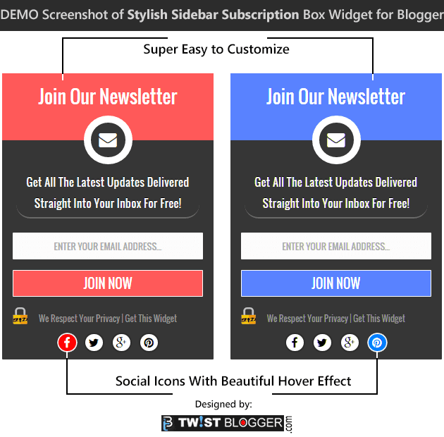
So here we go with the Demo Screenshot of our new stylish subscription box widget, see below.

Demo Screenshot of Stylish Sidebar Subscription Box


So did you like this widget? Here is how to install it into your template step by step.

Installing Sidebar Subscription Box Widget to Blogger Template

First of all we need to add the Font Awesome icons' CSS Stylesheet link to our blog in case you are not using it already.

Step 1) Logged into your blogger account? Now select your Blog > go to Template Section > Click on Edit HTML. Now let the template code box load.

Step 2) Now click anywhere inside the template code box and press Ctrl+F to open a search box inside. Now find out this opening <head> tag and just below it, paste the Font Awesome icon's link given below as it is.
<link href='http://netdna.bootstrapcdn.com/font-awesome/4.3.0/css/font-awesome.css' rel='stylesheet'/>
Note:- I have used Oswald font family in demo but I am not including it in the code below because your template may be using a different font family already. So avoid using multiple font families to maintain our blog load speed, it is necessary. I am using inherit for font-family so that your blog's default font family will automatically be loaded.

Step 3) Now save your Template code and go to Layout Area of your blog. This time click on "Add a gadget" link in the sidebar and add a HTML/JavaScript widget. Now paste the whole CSS and HTML code given below after making required changes given just below the code in editing step.

<style>
/* ----------------------------------------------------
Sidebar Subscription Box Widget = V.2
Designed by :: http://www.TwistBlogger.com
Keep These Credits Intact, Do Not Remove
-----------------------------------------------------*/
#twist-blogger-sbox-v2 {
  padding: 0;
  padding-bottom: 5px;
  font-family: inherit;
  display: block;
  margin: 0;
  width: 100%;
  border-radius: 1px;
  border: 0;
  background: #363636;
}
#twist-blogger-sbox-v2 .main_tagline {
  padding: 0px 0px;
  line-height: 2.5em;
  font-size: 26px;
  margin: 0;
  height: 95px !important;
  overflow: hidden;
  font-weight: normal;
  color: #FFF;
  text-align: center;
  border: 0;
  background-color: #FF5959;
}
#twist-blogger-sbox-v2 .email_icon {
  display: table;
  margin: -35px auto 0px;
  font-size: 25px;
  padding: 12px;
  height: 25px;
  width: 25px;
  background-color: #363636;
  color: #FFF;
  border-radius: 50px;
  border: 10px solid #FFFFFF;
  line-height: 0;
}
#twist-blogger-sbox-v2 p {
  font-size: 15px;
  color: #F9F9F9;
  text-shadow: 0px -1px 0px #000;
  line-height: 27px;
  padding: 5px 10px 5px;
  text-align: center;
  width: 80%;
  margin: 5px auto 20px;
  border-bottom: 2px solid #6A6A6A;
  border-radius: 20px;
}
#twist-blogger-sbox-v2 .rssform {
  padding: 0;
  margin: 0 auto;
  display: block;
}
#twist-blogger-sbox-v2 .rssform input {
  padding: 8px;
  margin: 20px auto 15px;
  font-size: 13px;
  color: #000;
  text-align: center;
  display: block;
  font-family: inherit;
  font-weight: normal;
  width: 90%;
  height: 38px;
  text-transform: uppercase;
  outline: none !important;
  border: 1px solid #FFFFFF;
  border-radius: 1px;
  background-color: #FCFCFC;
  box-sizing: border-box !important;
}
#twist-blogger-sbox-v2 .rssform .button:hover {
  background: #000000;
}
#twist-blogger-sbox-v2 .rssform .button {
  background: #FF5959;
  color: white!important;
  border: 1px solid #FFFFFF;
  margin-top: 15px;
  outline: none !important;
  transition: all .3s ease-in-out;
  padding: 5px 2px !important;
  float: none;
  text-transform: uppercase;
  font-size: 18px;
  font-weight: normal;
  cursor: pointer;
}
#twist-blogger-sbox-v2 .bottom_lock_policy {
  background: url(https://blogger.googleusercontent.com/img/b/R29vZ2xl/AVvXsEgZT1rsby_1hjuS_tFZW_6nWFc9caIY5q5zxelXoqMC4DCWwX6Qedh1wBri5Wym-ztRFvcPyMxLVqqzxbz2G94AMbPHlBHsK2wFYk952O202VzhjsL6IHpksQFAtHZv86yrVUemSiVzFEs/s1600/Lock-twistblogger.png) no-repeat 3% -2px;
  color: #959595;
  text-align: center;
  font-size: 12px;
  margin: 0;
  padding: 3px;
  line-height: 25px;
}
#twist-blogger-sbox-v2 .bottom_lock_policy a {
  color: #959595;
  text-decoration: none !Important;
}
#twist-blogger-sbox-v2 .social_profiles {
  line-height: 1.2em;
  display: table;
  float: none;
  margin: 0px auto;
  text-align: center;
  min-width: 157px;
  padding: 5px 0px;
  border: 0;
}
#twist-blogger-sbox-v2 .social_profiles a:hover {
  color: #FFF;
  background-color: #FF5959;
  border-color: #FFF;
}
#twist-blogger-sbox-v2 .social_profiles a {
  color: #000000;
  margin: 0 5px;
  text-align: center;
  float: left;
  display: table;
  padding: 4px 5px;
  background-color: #FFFFFF;
  border-radius: 50px;
  border: 2px solid #2D2D2D;
  width: 15px;
  height: 15px;
  line-height: 0;
  font-size: 16px;
  transition: all 0.3s ease-in-out;
  -webkit-transition: all 0.3s ease-in-out;
}
#twist-blogger-sbox-v2 form {
  margin-bottom: 10px !important;
}
</style>
<div id="twist-blogger-sbox-v2">
            <div class="main_tagline">Join Our Newsletter</div><div class="email_icon"><i class="fa fa-envelope"></i></div>
                 <p>Get All The Latest Updates Delivered Straight Into Your Inbox For Free!</p>
<div class="rssform">
            <form action="http://feedburner.google.com/fb/a/mailverify" method="post" target="popupwindow" onsubmit="window.open('http://feedburner.google.com/fb/a/mailverify?uri=TwistBlogger', 'popupwindow', 'scrollbars=yes,width=550,height=520');return true">
            <input type="text" name="email" placeholder="Enter your email address...">
            <input type="hidden" value="TwistBlogger" name="uri">
            <input type="hidden" name="loc" value="en_US">
            <input value="Join Now" class="button" type="submit">
            </form>
            </div>
<div class="bottom_lock_policy">We Respect Your Privacy | <a href="http://www.twistblogger.com/2015/07/new-stylish-sidebar-subscription-box-widget-for-blogger.html">Get This Widget</a> </div>
<div class="social_profiles">
<a href="http://www.facebook.com/TwistBlogger" target='_blank' rel='nofollow' title="Join on Facebook"><i class="fa fa-facebook"></i></a>
<a href="http://www.twitter.com/TwistBlogger" target='_blank' rel='nofollow' title="Follow on Twitter"><i class="fa fa-twitter"></i></a>
<a href="http://plus.google.com/+SatbirPatial" target='_blank' rel='nofollow' title="Follow on Google+"><i class="fa fa-google-plus"></i></a>
<a href="http://www.pinterst.com/twistblogger" target='_blank' rel='nofollow' title="Follow on Pinterest"><i class="fa fa-pinterest"></i></a>
</div>
            </div>

Editing:-
1) Changing the color scheme
For changing the default color, just find out this color code #FF5959 and replace it with the color code of your choice. Please note that you'll find this code three times in the above CSS so just replace it three times with the same color code of your choice. Be careful with the text color too because white text may not appear properly in some colors so just change the text color too.

2) Changing Main Headlines
They are highlighted in the very beginning of above HTML code so change those all if you wish to or let them as it is.

3) Changing FeedBurner Address
This is the important step so change my feedburner address TwistBlogger which is highlighted two times in the HTML. Replace mine with yours two times.

4) Removing the Backlink
My backlink to this post is highlighted in Light Blue color so remove it or keep it. :)

<a href="http://www.twistblogger.com/2015/07/new-stylish-sidebar-subscription-box-widget-for-blogger.html">Get This Widget</a>
5) Final step is just to remove my Social Profile Links and add yours. These links are highlighted in Red Color at the bottom of HTML so replace them with yours.

Finally save your HTML/JavaScript widget and visit your blog to check if it is working.

If anyhow something goes wrong or your did not understand what to change or anything else, just hit me back and I am there to support you with the complete installation process or I'll do it for you.

This is all in this post and now I am working on a Landing page template (simple) to which you can use to promote some Affiliate products. Hopefully I'll share it in a few days so stay tuned if you wish to use it. :) If you want to create a landing page on your existing blog then just follow this ultimate guide to create Squeeze Pages or landing pages on blogger.

Now you can help me by sharing this post on at least one social media platform of your choice, your support is all I need to keep going. Connect with me on Facebook by liking my page or adding me on Google plus or by following on twitter. Stay Blessed!

Add An Elegant HTML Sitemap Page to Blogger Blog

Add HTML Sitemap Page to Blogger Blogs
A sitemap page is one of the must have pages on every blog. It helps in a number of ways to increase the user engagement on our blog and makes it more user friendly.

By using the sitemap page, visitors of our blog can easily navigate through the all of our published content under different categories they are interested in.

Ultimately our blog's page-views increase and bounce rate decrease. Good for SEO, no? :)

After using the sitemap page on my blog for a long time now, I can say it is one of the most visited pages on my blog. When visitors find out the content on your blog more useful, they hunt for more content like this on your blog and if a sitemap page is available on your blog, what else do they need more?

This tutorial has been requested multiple times and I could not come up with it on time due to some personal reasons. Today I am sharing the exact code I am using on my blog for sitemap.

UPDATE: 10/5/2016

Google Drive has Stopped Hosting so I have updated JavaScript file to another hosting service which is free called YourJavaScript.com ! Please note that this hosting provider does not use HTTPS so these codes may not work on blogger sub domain names but will work fine with custom domain names.


Credits-
The code I am going to share is issued by +Taufik Nurrohman. He is from Indonesia and he has done so much for blogger platform users by releasing the amazing scripts for free. We owe to him.

Most of the template designers who are selling blogger templates on ThemeForest.com use his scripts to add amazing functionalities and awesome features to their templates.

Visit DTE Project on Googlecode to find out all of his creations including the Tabbed Table of Content code I am about to share today.

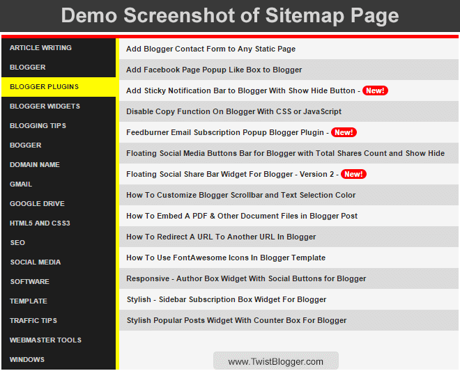
Demo Screenshot of Sitemap Page We Are Going To Add

Blogger Sitemap Page Screenshot


Live demo can be seen by visiting the sitemap page of this blog.

Please note that I did not add any new functionalities or modified this sitemap code but I just played with the CSS code to give it an elegant look and to match the color theme of my blog.

You can do the same and I'll explain it in detailed steps. Lets begin the process.

Recommended: Create Professional Looking Landing Pages On Blogger Blog


Step 1. Create A New Page On Your Blog

First of all just create a new page on your blog then change the page settings and switch to HTML mode. Enter the name of the page as "Sitemap" in the Title area to get the same permalink for your new page. See the screenshot below.

Creating A New Page On Blogger


Step 2. Copy And Paste The Whole JavaScript and CSS Code

When you'll switch to the HTML mode, you'll see the few lines of HTML code inside the post editor already added by default so just select those all and remove them. Now paste the whole code given below in the post editor. For further customization and to match the color scheme of your blog, read the Editing step given below the code.

<div id="tabbed-toc">
<span class="loading">Loading, please wait for a moment...</span></div>
<br />
<script type="text/javascript">
var tabbedTOC = {
    blogUrl: "http://www.twistblogger.com", // Enter your blog URL
    containerId: "tabbed-toc", // Container ID
    activeTab: 1, // The default active tab index (default: the first tab)
    showDates: false, // `true` to show the post date
    showSummaries: false, // `true` to show the posts summaries
    numChars: 200, // Number of summary chars
    showThumbnails: false, // `true` to show the posts thumbnails (Not recommended)
    thumbSize: 40, // Default thumbnail size
    noThumb: "", // A "no thumbnail" URL
    monthNames: [ // Array of month names
        "January",
        "February",
        "March",
        "April",
        "May",
        "June",
        "July",
        "August",
        "September",
        "October",
        "November",
        "December"
    ],
    newTabLink: true, // Open link in new window. `false` to open in same window
    maxResults: 99999, // Maximum post results
    preload: 0, // Load the feed after 0 seconds (option => time in milliseconds || "onload")
    sortAlphabetically: true, // `false` to sort posts by published date
    showNew: 7, // `false` to hide the "New!" mark in most recent posts or
//define how many recent posts are to be marked by changing the number
    newText: " - <em style='color: white;padding: 1px 5px;border-radius: 20px;background-color: #F00;'>New!</em>" // HTML/CSS for
//the "New!" text
};
</script>
<script src="http://yourjavascript.com/51107864021/tabbed-toc-defaults.js" type="text/javascript"></script>
<style>
/*Sitemap  */
#tabbed-toc {
 width: 99%;
 margin: 0 auto;
 overflow: hidden !important;
 position: relative;
 color: #222;
 border: 0;
 border-top: 5px solid #FC0204;
 background-color: #1D1D1D;
 -webkit-transition: all 0.4s ease-in-out;
}
#tabbed-toc .loading {
 display:block;
 padding:5px 15px;
 font:normal bold 11px Arial,Sans-Serif;
 color:#FFF;
}
#tabbed-toc ul,
#tabbed-toc ol,
#tabbed-toc li {
 margin:0;
 padding:0;
 list-style:none;
 }
#tabbed-toc .toc-tabs {
 width: 24.8%;
 float: left !important;
}
#tabbed-toc .toc-tabs li a {
 display:block;
 font:normal bold 10px/28px Arial,Sans-Serif;
 height:28px;
 overflow:hidden;
 text-overflow:ellipsis;
 color:#ccc;
 text-transform:uppercase;
 text-decoration:none;
 padding:0 12px;
 cursor:pointer;
  -webkit-transition: all 0.3s ease-in-out;
}
#tabbed-toc .toc-tabs li a:hover {
 background-color: #515050;
 color: #FFF;
 }
#tabbed-toc .toc-tabs li a.active-tab {
 background-color: #FFFC03;
 color: #222;
 position: relative;
 z-index: 5;
 margin: 0 -2px 0 0;
}
#tabbed-toc .toc-content,
#tabbed-toc .divider-layer {
 width: 75%;
 float: right !important;
 background-color: #F5F5F5;
 border-left: 5px solid #FFFC03;
 -webkit-box-sizing: border-box;
 -moz-box-sizing: border-box;
 box-sizing: border-box;
 -webkit-transition: all 0.3s ease-in-out;
}
#tabbed-toc .divider-layer {
 float:none;
 display:block;
 position:absolute;
 top:0; right:0; bottom:0;
}
#tabbed-toc .panel {
 position:relative;
 z-index:5;
 font:normal normal 10px Arial,Sans-Serif;
}
#tabbed-toc .panel li a {
 display: block;
 position: relative;
 font-weight: bold;
 font-size: 11px;
 color: #222;
 line-height: 2.8em;
 height: 30px;
 padding: 0 10px;
 text-decoration: none;
 outline: none;
 overflow: hidden;
 -webkit-transition: all 0.3s ease-in-out;
}
#tabbed-toc .panel li time {
 display:block;
 font-style:italic;
 font-weight:400;
 font-size:10px;
 color:#666;
 float:right;
}
#tabbed-toc .panel li .summary {
 display:block;
 padding:10px 12px;
 font-style:italic;
 border-bottom:4px solid #275827;
 overflow:hidden;
}
#tabbed-toc .panel li .summary img.thumbnail {
 float:left;
 display:block;
 margin:0 8px 0 0;
 padding:4px;
 width:72px;
 height:72px;
 border:1px solid #dcdcdc;
 background-color:#fafafa;
}
#tabbed-toc .panel li:nth-child(even) {
 background-color: #DBDBDB;
 font-size: 10px;
}
#tabbed-toc .panel li a:hover,
#tabbed-toc .panel li a:focus,
#tabbed-toc .panel li a:hover time,
#tabbed-toc .panel li.bold a {
 background-color:#222;
 color:#FFF;
 outline:none;
 -webkit-transition: all 0.3s ease-in-out;
}
#tabbed-toc .panel li.bold a:hover,
#tabbed-toc .panel li.bold a:hover time {
 background-color:#222;
}
@media (max-width:700px) {
#tabbed-toc {
 background-color:#fff;
 border:0 solid #888;
}
#tabbed-toc .toc-tabs,
#tabbed-toc .toc-content {
 overflow:hidden;
 width:auto;
 float:none !important;
 display:block;
}
#tabbed-toc .toc-tabs li {
 display:inline;
 float:left !important;
}
#tabbed-toc .toc-tabs li a,
#tabbed-toc .toc-tabs li a.active-tab {
 background-color:#222;
 color:#ccc;
}
#tabbed-toc .toc-tabs li a.active-tab {
 color:#000;
}
#tabbed-toc .toc-content {
 border:none;
}
#tabbed-toc .divider-layer,
#tabbed-toc .panel li time {
 display:none;
}
}
</style>


Editing:-
1) To change the message which appears before the sitemap is loaded, change this "Loading, please wait for a moment..." line to your own.

2) Replace my blog URL with your blog URL by replacing http://www.twistblogger.com and those who are using the free blogspot domain name, change your country specific extension to .com at the end of the URL.
For example, change http://yourblog.blogspot.in to http://yourblog.blogspot.com where .in is a country specific TLDN for Indian users, got it?

3) Color scheme is yellow and you may like to change it to your blog's color scheme. To change the yellow color just replace this #FFFC03 color code to your own which appears two times in the CSS code above.

Finally hit Publish button and visit your sitemap page to check if it is working or not. It should be 100% working for everyone.

Recommended: Add Blogger Contact Form to Any Static Page


Hide The Specific Labels And Show Selected Labels Only

What if you have a huge list of labels and you only want to show the selected labels on your sitemap page? This script automatically fetches all the labels and shows them all in the sitemap. We can't stop appearing unwanted labels or show the selected labels only with the script. It will generate and show all the labels of your blog in your sitemap.

Many of you guys may don't like to show all of your labels if they are above 100+ so in that case, I have a simple solution to hide the unwanted labels from appearing and show only the selected ones.

This is possible with simple CSS code so please read the steps carefully and be ready to follow a boring task. :)

Step 1. Selecting The Labels To Hide

First of all just visit your newly published sitemap page and let the sitemap load. You will see all the labels listed and sorted alphabetically on left side (if you did not change the settings from JavaScript).

Now start counting your labels. Yes you heard it right. :p

Because you need to note down the number of the label you want to hide. Usually counting starts from 1 but you have count from ZERO. It means your very first label is on number ZERO in the list and second label is on number one. Same goes on till the end.

Step 2. Add The Number of The Label To The Class Name

Finally if you have noted down all the numbers of labels you want to hide then now add the numbers to this class name .toc-tab-item-ADD-NUMBER and add those all the classes together just like the example code given below:-

<style>
.toc-tab-item-0, .toc-tab-item-1, .toc-tab-item-5, .toc-tab-item-7 {
  display: none !important;
}
</style>

In the above CSS code, I have selected the label number 1, 2, 4 and 6 to hide (Remember to count from ZERO=1). Use the above code as a reference and add all of the numbers of the labels like as I did in the example code above. Ask me in comments if  you did not get it.

After adding all those classes, go back to edit the sitemap page then just add this CSS code inside your sitemap page like as you have added the previous codes. Now update your page and see the results if they are as expected or not.

Finally this is all I could do in this tut and I hope it is simple enough to understand for newbies too.
If you're facing any kind of problem or need any help regarding further customization of your sitemap page then just leave your message in the comments or shoot me an email. Your feedback is much appreciated.

I'll definitely get back to support you. Support me by sharing this post and socializing with me. :) Stay Blessed!